
Methods#
Show code cell source
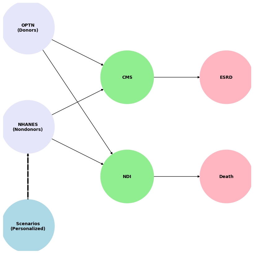
import networkx as nx
import matplotlib.pyplot as plt

G = nx.DiGraph()
G.add_node("OPTN", pos=(-4000, 800))
G.add_node("NHANES", pos=(-4000, 0))
G.add_node("Scenarios", pos=(-4000, -800))
G.add_node("CMS", pos=(0, 400))
G.add_node("NDI", pos=(0, -400))
G.add_node("ESRD", pos=(4000, 400))
G.add_node("Death", pos=(4000, -400))

G.add_edges_from([("OPTN", "CMS"), ("OPTN", "NDI")])
G.add_edges_from([("NHANES", "CMS"), ("NHANES", "NDI"), ("Scenarios", "NHANES")])
G.add_edges_from([("CMS", "ESRD"), ("NDI", "Death")])

pos = nx.get_node_attributes(G, 'pos')
labels = {"OPTN": "OPTN\n(Donors)",
          "NHANES": "NHANES\n(Nondonors)",
          "Scenarios": "Scenarios\n(Personalized)",
          "CMS": "CMS",
          "NDI": "NDI",
          "ESRD": "ESRD",
          "Death": "Death"}

# Update color for the "Scenarios" node
node_colors = ["lavender", "lavender", "lightblue", "lightgreen", "lightgreen", "lightpink", "lightpink"]

edge_styles = [("NHANES", "Scenarios", "dashed")]

plt.figure(figsize=(8, 8))
nx.draw(G, pos, with_labels=False, node_size=15000, node_color=node_colors, linewidths=2, edge_color='black', style='solid')
nx.draw_networkx_labels(G, pos, labels, font_size=10, font_weight='bold')
nx.draw_networkx_edges(G, pos, edgelist=edge_styles, edge_color='black', style='dashed', width=3)
plt.xlim(-5000, 5000)
plt.ylim(-1000, 1000)
plt.axis("off")
plt.show()
\[\Large 1-e^{-\int h_0(t)exp(X\beta)}\]
Where:
\(h_0(t)\)
Nonparametric hazard for the base-case
\(exp(X\beta)\)
Maximum-likelihood estimate of the difference (on a log scale) between the hazard for the base-case and the hazard for the specific clinical scenario with explanatory variables \(X\)
\(t\)
Years of follow-up (tentatively 15y but will update to 30y later in January).